University of Louisville
2323 S. Brook St.
Louisville, KY 40208
Brand Identity & Visual Standards
Guidelines for creating UofL-branded marketing materials and websites
The University of Louisville brand has a rich history stretching back to the 1800s. Below are major milestones in our brand timeline that have established significant visual changes.

The university’s seal depicting the Roman goddess of wisdom has been used since at least the early 1850s. The current version was designed by Victor Hammer (and also the seals of the City of Louisville and the Louisville Free Public Library) and reworked in 1992 by Steven Skaggs, professor of graphic design.
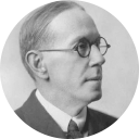
The wife of Liberal Arts dean (and eventual UofL president) John Patterson suggests the adoption of the state bird as the mascot for athletics department, as well as red & black school colors.
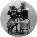
Two female cheerleaders, along with fellow cheerleader T. Lee Adams create a cloth Cardinal head. Uniforms and merchandise use generic L in collegiate slab serif.
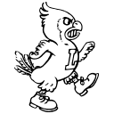
Early version of student-drawn mark.

Not an officially-adopted logo, but used primarily by the football team, under coach Vince Gibson, for several years in the late 1970s. Designed by Stewart Winner Inc.

Commissioned under President Miller at a cost of $1,000, the mark (intended to compliment the university seal) was never fully adopted due to controversy.

First identity program released to complement the Minerva. Designed by Stewart Winner Inc., it included a monogram, one-line logo and stacked logo. Brand typography was established as Caslon 540 and Helvetica.
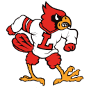
The first effort at establishing official university athletic logos. Several additional sport-specific logos were illustrated by a student on the baseball team.
The department of athletics rebranded the mascot and logos during this time period. Created by the firm SME from New York City. The gothic L was introduced by football coach John L. Smith during this time as well.

Complete overhaul of non-athletic brand and identity by SME. “It’s Happening Here.” tagline launched. Academic red changed to PMS 1797 and secondary palette remastered. Introduction of new primary logo, new monogram and new secondary logos. Regulations set on what university entities qualified for marks. Typefaces chosen were Helvetica Neue, Giovanni and Delta Jaeger.

Added script typeface Brisa, a one-line version of the logo, removed icons for secondary logos, remastered all logos for consistency and partially retired the “It’s Happening Here.” tagline.
Athletics changed website URL and launched a collection of promotional marks. Louisville First Cards Forever mark created. Athletic Red changed to PMS 200.
First comprehensive brand standards manual for athletics. Bird head made primary mark (retiring winged bird). L1C4 and GoCards.com marks subverted. Established typefaces as Gotham, Mercury and Vitesse.

Retirement of “It’s Happening Here.” tagline. New typefaces (Gotham, Mercury, Knockout), introduction of campaign typeface, new secondary color palette. Additional guidelines for digital, social, photography and merchandise also added.