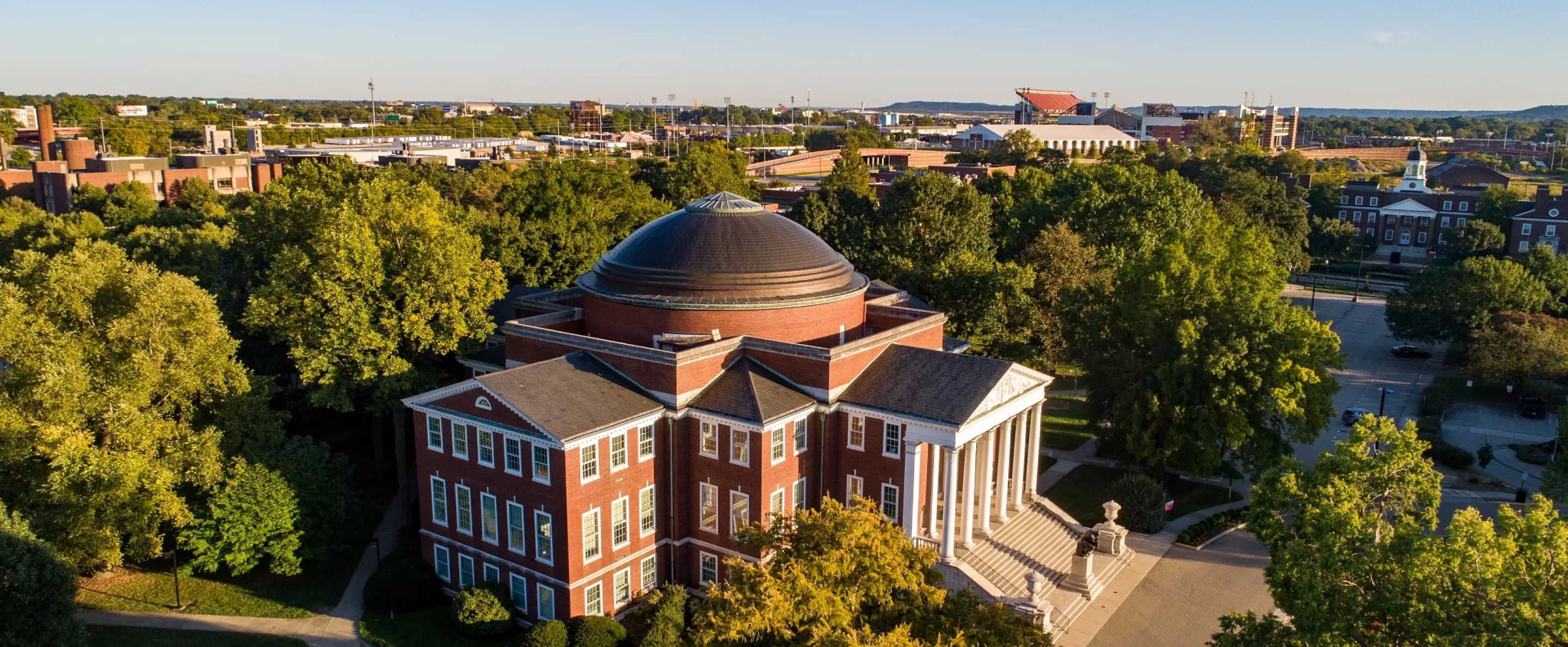
Video Branding Guidelines
The information provided was created to be a resource with some simple rules that we all commit to follow in order to streamline and simplify the process of creating one University of Louisville voice. When we follow these guidelines, we will present a more single-minded, unified image of our state and maximize the investment in the brand.
Table of Contents
- Logo Usage
- Monogram Usage
- Typeface and Text Recommendations
- Color Palette
- Pre-roll/Intro
- Post-roll/Closing
- Backgrounds
- Lower Thirds
- Tips on uploading your Video to Web
Safe Zones*
*this does not apply if your video is only being viewed on the web
When editing movies it is important to keep the action within “action safe” and “title safe” areas of your editor. Safe area is a term used to describe the areas of the television picture that can be seen on television screens. The safe action area is defined as the area in which “all significant action must take place”, and the safe title area is where “all the important information must be confined to ensure visibility on the majority of home television receivers.” Never put captions, titles or credits in the outer 10% border around the video. It may not show up on all TV’s. You may also want to make sure important action is with the 5% border.

Logo Usage
The logo must be used as is and can not be modified under any circumstances without permission. All logos should be used at screen resolution, 72dpi in RGB color mode. Please do not scale any logos larger than file provided, or it will result in pixelation. If it needs to be scaled down, please constrain proportions. To ensure the legibility of the logo, it must be surrounded with a minimum amount of clearspace. This isolates the logo from competing elements such as photography, text or background patterns that may detract attention and lessen the overall impact. Using the logo in a consistent manner across all applications helps to both establish and reinforce immediate recognition of the University of Louisville brand.
An example of clearspace:
There are no absolutes regarding the selection of the specific color application, but context, contrast with regard to background color and surrounding imagery and production parameters all should be considered. Multiple formats have been provided to ensure compatibility with any software.
DOWNLOAD LOGOS HERE*
* If you need your unit or departments' secondary logo, please fill out this request form and allow 24-48 hours for delivery.
Monogram Usage
There are three single-color versions of the University of Louisville monogram. There are no absolutes regarding the selection of the specific color application, but context, contrast with regard to background color and surrounding imagery and production parameters all should be considered. Multiple formats have been provided to ensure compatibility with any software.
DOWNLOAD MONOGRAMS HERE

The monogram can also be used as an ID or corner bug for your video, this application requires the use of either the black or white monogram at 50% opacity, placed in the lower left corner of the video.

Typeface and Text Recommendations
The UofL brand fonts are Delta Jaeger, Helvetica Neue and Giovanni. The weights and styles shown here are recommended for most uses. Please follow these tips and guidelines when using the typefaces.
- Text should be in either black or white at all times to ensure enough contrast between the text and background.
- Do not use any filters on text such as drop shadows, outlines (strokes), glows, etc.
- Be aware of Safe Zones to guarantee no text is cut off during playback on varying platforms.

Color Palette*
*given in both Hexadecimal and RGB values
-
primary color palette (preferred color usage)

-
secondary color usage (for background usage)


PLEASE NOTE : All video assets provided (below) are formatted in SD (Standard Definition), if you need HD (High Definition) please fill out this request form and allow 24-48 hours for delivery.
Pre-roll/Intro
Insertion: before content - should have a 5 second fade into content
Duration: is 5-10 seconds
Dimensions: 720x480
DOWNLOAD PRE-ROLL/INTRO HERE: (.mov)
Post-roll/Closing
Insertion: after content - should have a 5 second fade from content into post-roll
Duration: is 5-10 seconds
Dimensions: 720x480
DOWNLOAD POST-ROLL/CLOSING HERE: (.mov)
Backgrounds (there are 5 options to choose from)
Insertion: Behind any content (text, photograpy, video)
Duration: Up to producers discretion, all templates available for download are loopable.
Dimensions: 720x480
DOWNLOAD BACKGROUNDS HERE: (backgrounds.zip)

HEADING
Font: ITC Giovanni Black
Text Size*: 45px
Tracking (refers to the distance between characters): 25px
SUBHEAD
Font: Helvetica Neue Bold (ALL CAPS)
Text Size*: 25px
Tracking (refers to the distance between characters): -25
Leading (refers to the distance between lines of text): 28px
BODY COPY
Font: Helvetica Neue Regular
Text Size*: 21px
Tracking (refers to the distance between characters): 5
Leading (refers to the distance between lines of text): 32px
*Note: Text should not be smaller than 21 pixels and only in either black or white; to ensure that there is sufficient contrast between text color and background
Lower Thirds
In video and television, the lower third refers to the lower portion of the frame which contains graphical information such as station ID, name/title keys, etc.
In a talking head shot like the one pictured below, the lower third graphics sit somewhere below the presenter's shoulders.
In most cases the graphics don't actually take up a full third of the picture. If the only requirement is a name/title key, not much space needs to be used. On the other hand, for programs which need to include a lot of information, the full third may not be enough and a side panel is added.
DOWNLOAD LOWER THIRDS HERE (there will be no background color included in files, this is just an example)
- STYLE RECOMMENDATIONS FOR TEXT TO BE PLACED ON LOWER THIRDS (see above for example)
NAME/ID
Font: ITC Giovanni Black
Text Size*: 45px
Tracking (refers to the distance between characters): 25px
SUBHEAD
Font: Helvetica Neue Bold (ALL CAPS)
Text Size*: 25px
Tracking (refers to the distance between characters): -25
Tips on uploading your Video to Web
(back to top)
Before you upload a video, you'll have to convert it to a format
that's acceptable to the video hosting site that you've chosen. Most
hosting sites only accept certain video formats, and many limit the
file size the length of the videos you upload. Many video editing
programs offer customizable export settings so you can control the size
and the format of the final video. You can also use video compression
software to convert your videos to an online format. For best results, compress your videos with the following settings before uploading to the web.
- Video format: MPEG-4, or MPEG-2,
- Audio format: mp3 or mp4
- 30 frames per second
- Resolution: 640 x 480
- Aspect ratio: 4 x 3
- De-interlace
It's common practice to keep web video length under three minutes. This comes from the idea that people watching web videos are just browsing, get distracted easily and won't sit through anything that goes over 180 seconds. Keeping web video length short also lets you keep the file size small, which uses less bandwidth and loads faster. Video sharing web sites have also contributed to short video phenomenon by limiting the length of videos users can upload.


